



Unpaid Models is a lead funnel designed for an Instagram and Facebook Ad campaign. The objective is for models that have received late payment or are still waiting for payment to contact the Lawyer. The landing page is designed to offer immediate value by informing models of the potential payout they are entitled to, while also appealing to the emotional call for justice. This funnel has confirmation page that integrates with a Hubspot CRM and Calendly. It uses custom event tracking pixels for a full retargeting and profiling strategy.
UNPAID MODELS
WESTERN RITE CONFERENCE

Western Rite Conference 2020
The Western Rite Conference is a time for orthodox churches in the western rite to come together, commune with other parishioners and hear from leaders in the church. This is a yearly event hosted by a different church each year. This site was designed to both represent the event and the church hosting the event. The goal was to create a cost effective registration portal that would let the church easily manage reservation and travel accommodations. This site used copy written by the priest, and pictures from the churches social accounts to create a consistent aesthetic and image.
WESTERN RITE CONFERENCE

Before I sat down with the client to establish a brand and design, I did market research on the KonMari method. I wanted to know who was using this service and why. The goal was to use this information to define a specific problem that my client’s service was solving. Using google trends as well as keyword and social media research, I discovered that the central problem was physical and mental clutter. This problem was creating an obstacle to achieving other life goals like career advancement and improved personal relationships.
The consulting process started with a name. I sat down with the client and explained the process from A to Z. Starting with the domain and hosting and ending with the key objective of sales conversions. With that in mind, we brainstormed name ideas that would establish a brand that captured the client’s personality and goals. We landed on Centered Space LA because it was a unique expression/take on the KonMari Method. It told a story that no other Konmari consultant was telling. Effective home organizing or tidying starts with establishing a center of goals and priorities from which you can orient your physical and mental space. This is a brand story that offers a unique solution to the problem of mental and physical clutter.
02. The Logo
I designed a logo that would capture the branding story. I was inspired by how the client’s personal faith informed his philosophy of Tidy. Organizing ones belongings is a mystical process that aims to align earthly space with heaven. I used an old symbol from antiquity as the basis of this logo. The classic symbol is a circle in a square. The circle represents heaven and the square represents earth because of our perspective from the ground. The sky appears to be shaped a s dome and the earth appears to be shaped as a flack square.

Following this symbolism, I created the two smaller squares to represent the self and our surrounding space. I used the golden ratio to calculate the area of both squares. The placement of these squares within the circle represents our orientation between our personal space space and heaven. This resulted in a very simple design that fit the name without understanding the symbolism.
03. The Funnel
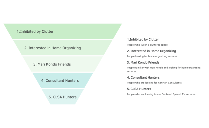
I patterned the rest of the site using this simple geometric imagery. The goal was to create the framework and marketing funnel for the client to use in building the rest of the site. Here are the audiences that I identified in the marketing funnel:
04. The landing page
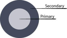
The landing page has three strategically placed call to actions. There is a call to schedule a free consult in the header, start the re-centering process by viewing the services in the center of the body, and a call to learn more at the bottom. All of these are catered towards different audiences in the funnel. I combined the audiences into three different groups and prioritized them into primary and secondary:
Primary:
- People looking for decluttering services and people familiar with Mari Kondo. (Middle section of funnel)
Secondary:
- People who are looking for KonMari Consultants and people who are looking to use Centered Space LA’s services (Bottom of funnel)
- People who live in a cluttered space (Top of funnel)
05. The landing page
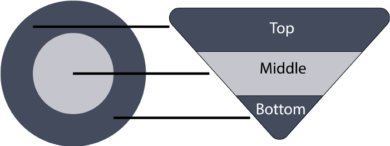
I organized this into primary and secondary categories because my design distributes attention in a bullseye shape across the site. The most attention lives in a limited section in the center and decreases evenly from that point, forming a bullseye shaped map. I placed the middle section of the funnel in the center of the bullseye because it is the optimal relationship between traffic volume and proximity to conversion.
All three audience groups have their own call to action strategically placed in a primary or secondary space:
Secondary Space: Bottom of funnel CTA
Primary Space: Middle section of funnel CTA
Secondary Space: Top of funnel CTA
05. AIDA
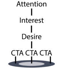
This map of attention overlays the basic structure of Attention. Interest. Desire. Action. This combined with the visual layout results in the bullseye shape of focal attention:
06. Attention
Centered Space LA (An Invitation)
The hero section is the introduction to this map. My goal was to create an invitation to focus attention below for more information. I designed the logo to take up the entire space of the hero because I didn’t want any other distractions when visiting the page. I wanted the hook to be simple and compelling enough to continue scrolling for more information. I also wanted to add something right beneath the fold that establishes exactly what the site is. Many of his competitors made the mistake of assuming that visitors knew what they were looking at. I avoided using an extensive explanation of the services because the goal was to quickly transition to generating interest. This is why I framed it as a short introduction to the consultant.
07. Interest
Taking Control (Defining The Need)
I used this geometric pattern in the interest section to complement the logo. Adding the animation of the business owner’s image balanced the logo’s animation, creating a centering effect. This combined with the entrance of the consultants face generated visual interest in this region. The hope was to direct the attention to the copy on the right.
Establishing the goal of taking control generates interest by speaking to the central problem of this audience. Their mental and physical clutter is an obstacle to taking ownership of the various spheres of their life. I wanted to generate this interest around the bullseye section because this need applies to every person in the funnel. The specificity of how to meet that need is dependent on the audience. I cater to different audiences as I start to frame the solution.
08. Desire & Action
Offering a Solution
I generate desire by clarifying the problem of clutter, creating empathy and offering a solution. This copy is written to the primary audience. I kept this short and to the point because the audience already had an understanding of how and why the Mari Kondo method worked. I didn’t reference Mari Kondo in this copy because the key to winning this audience is to stand out from the competition. Instead of repeating information they are already aware of, I used the words off centered and space to incorporate the brand into the solution. This informs the visitor that Centered Space LA is offering something more than the competitors.
The next step in the conversion process for this audience is to view the services page. This is where they can complete the acquisition process through selecting the service package and scheduling the phone consult. The re center today button integrates the brand again in the call to start this process.
08. Desire & Action
Offering a Solution
If the viewers are in the secondary audience and not ready to respond to the call to “re center”, I use the section below to generate desire to “learn more” about the process. I reference the Mari Kondo without fully explaining it. The goal is to spark curiosity here. This audience is less informed, so referencing something they are not familiar with is an implicit invitation to learn more. Even though the copy implies that the author assumes that the audience is familiar with Mari Kondo, it is actually addressing those who are not familiar. This is a way to create mimetic desire. This language communicates that Mari Kondo is a viral sensation without explicitly stating so. This audience is motivated to learn more about Mari Kondo and how Centered Space LA is connected.
The about section walks the viewer through the ethos of Centered. It does all of this without explicitly walking the reader through the Mari Kondo Story. This keeps the Centered Space LA brand at the center of the reader’s attention. I did not want to create the impression that Centered Space LA is purely an extension of the KonMari method. I want the reader to know that Centered Space LA exists separate from Mari Kondo.
CENTERED SPACE LA


Blogging Campaign
Jumpstartbk.com was a bankruptcy law firm site with a page and domain authority of 2. The objective of this campaign was to build search traffic momentum by creating trending content that would get shared across social platforms. The intention was to rank for a cluster of keywords around debt. This campaign consisted of three blogs shared organically across Facebook and Reddit. They acquired 72 ranked keywords that increased the monthly search visits from 5 to 92. This campaign achieved 22 backlinks, the domain authority is now 13 and the highest page authority is 20.
CONTENT MARKETING

RE BRANDING LOOK LAW FIRM

Rebranding Look Law Firm
Look Law Firm was originally designed to be a Law Firm for Filmmakers and creatives. The site was designed so that the service offerings followed a classical story arch of the filmmakers journey through making a film. The lawyer also wanted to provide services to small businesses and entrepreneurs. When Coronavirus hit, he pivoted his site to target small business looking for guidance through federal relief programs. The site was re-designed to around a hopeful color pallet and relief theme. It used the same spotlight image as the arc of the brand. Instead of the brand narrative saying,” look here” it is saying “look up.” This was a seamless pivot for the firm. I populated the site with resources, managed a LinkedIn and facebook account, and did some content marketing.
REBRANDING LOOK LAW FIRM